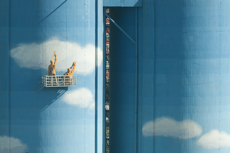
A blue sky is what we are working for. Photo Credit: Flickr/Chen Wu
Here at Seeder, we believe China’s blue sky should not be so rare and come with such a huge price tag. Leaner energy sources – especially rooftop solar – can dramatically reduce pollution while at the same time being a huge boost to a company’s balance sheet. That is why we are working to simplify the transition to clean energy. We help companies quickly value energy saving opportunities, and connect them with the right engineers and financiers.
Over the past year, we’ve evolved a lot:
- We narrowed our focus onto rooftop solar.
- We’ve developed a pipeline of over 10 MW, mostly with Fortune 500 companies.
- We expanded our partnerships and now have access to 5 top panel manufacturers, EPCs with experience developing over 5 GW of solar projects, and more than $4.3 billion in project capital for distributed solar.
- We introduced the Seeder Solar Calculator, a fast way to assess your facility’s rooftop solar potential.
- We were awarded the ChinaBang Award for the best international startup company and have been published in numerous international media outlets including the Wall Street Journal.
After all these breakthroughs, we realized that our brand elements didn’t express us as well as they used to. It was time for a brand refresh. Today we are excited to introduce our new branding: A fresh new look that more effectively conveys our purpose and our approach to making clean energy more accessible.
A fresh new look that more effectively conveys our purpose and our approach to making clean energy more accessible.
New Logo
The nature and seeds inspired the typeface of our new logo. The leaf-like tips on each letter are our wish to seed buildings with clean energy and the hope to grow ourselves. A paper plane-shaped emblem captures both Seeder’s “S” and our pursuit for a bright future.
This logo was developed by PRISMO China through an innovative VI3 project. Click here to learn more about the entire design process.
New Theme Color
Seeder is moving away from green, and turning into blue! Why blue? That’s because we take the blue sky as our inspiration and the goal of our work. We are expanding our horizon from each individual green building the green Seeder has seeded to the common blue sky that they unitedly build.
New Chinese Name
Along with the new branding, we are introducing a new Chinese name. “曦得” or “Xi De” sounds closer to our English name, and its meaning – harvesting sunshine – will carry our vision forward with a much clearer focus on solar.
New Domain
Along with the new branding, we are switching to a new web address and email domain name. Now you can find us at seederenergy.com, and our emails will be sent from @seederenergy.com as well (though we are still reachable via the old email addresses).
Our purpose remains the same. We are facilitating the world’s clean energy transformation, one building at a time.
Same Purpose
Even though many aspects of Seeder’s approach and branding are new, what we hope to achieve remains the same. To clean up the air in China and reduce greenhouse gases in the fastest and most cost-effective way possible by making clean energy accessible to every building in China. We do this by matching project needs more efficiently which will increase the speed at which projects happen and reduce risk and uncertainty with additional oversight and vendor qualification. Both of which will decrease the cost of solar and the cost of capital for project financing which will make even small projects financially viable and allow us to do a much greater number of projects.
The new branding energizes us to work better with our partners and clients, and together create a sustainable future for all.
Tell us what do you think about our new identity by reply here or email us.


